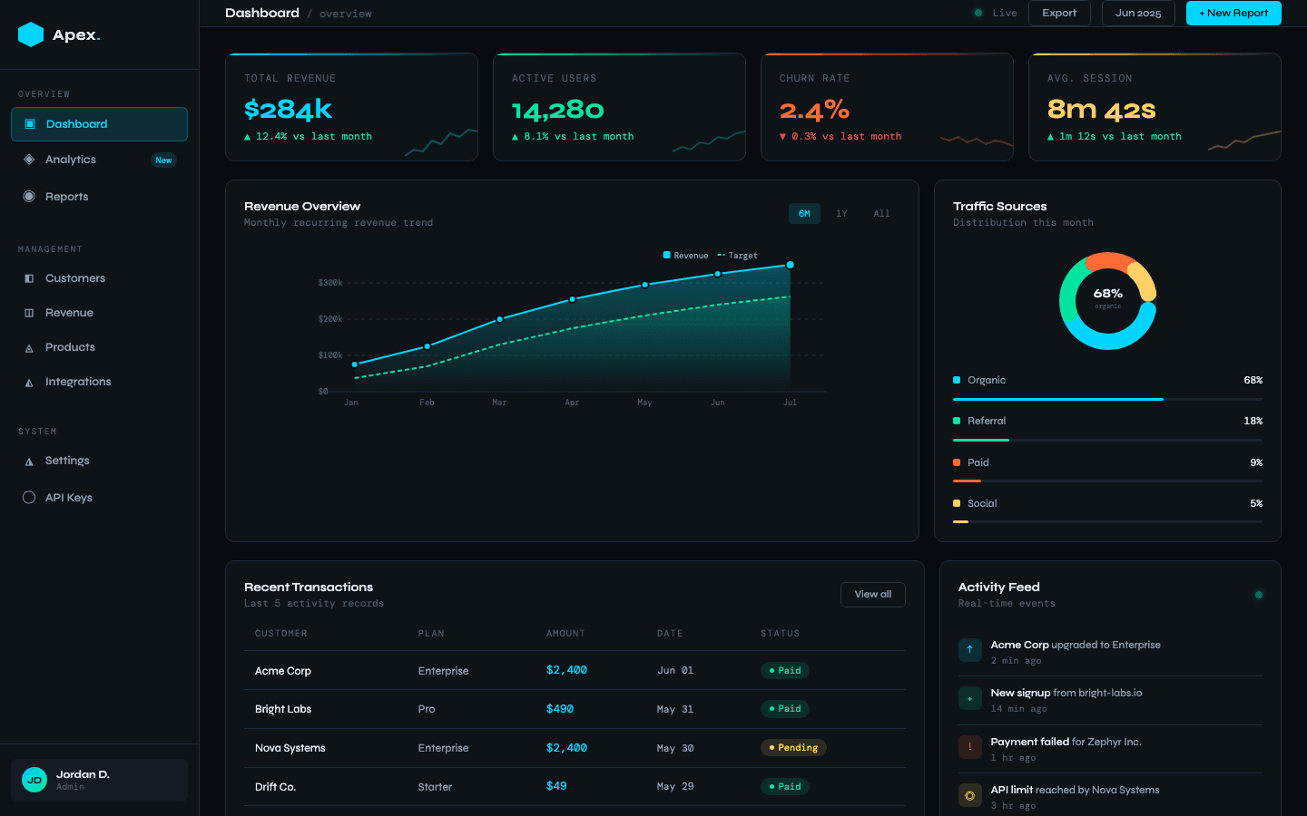
The challenge
The team behind Apex Analytics assembled their weekly reporting by hand. Exports from three systems, pasted into spreadsheets, screenshotted into slide decks. The data existed. Seeing it was somebody's part-time job.
They needed one live dashboard the whole team could check daily, without hiring a data engineer or paying for a six-figure BI platform.
What we did
Start from the questions
We listed the questions the team asked every week and designed one view per question. The data schema came second.
Live data, not exports
REST integrations pull straight from the source systems, so the dashboard shows right now, not last Friday.
Each role gets its own front door
Leadership sees trends and summaries. Operators see queues and detail. Same data underneath.
Ship the core, then grow
Version one launched with the three views that mattered most. The delivered source code makes adding the rest straightforward.
The outcome
The weekly spreadsheet ritual is gone. Reporting that used to eat hours of manual assembly is now a URL the whole team checks in seconds, with numbers that are current instead of five days old.
